Corporate Digital Banking · Standard Chartered Bank
Giving corporate treasurers one trustworthy view of global cash, under strict regulatory control.
I led the experience strategy for a corporate treasury platform that unified global liquidity visibility and redesigned maker/checker payment approvals, so speed and segregation of duties no longer pulled against each other.
Executive snapshot
- Client
- Standard Chartered Bank · Global Markets
- My role
- Lead UX Strategist and Systems Architect
- Users
- Corporate treasurers, CFOs, AP/AR operations teams
- Integrations
- SAP and Oracle host-to-host, bank APIs
- Constraints
- Basel III, segregation of duties, audit trails
- Partners
- Product, risk, compliance, engineering, operations
01 · The stakes
Visibility and control were both failing the same users.
The legacy portal split cash across disconnected regional accounts. Treasurers built their own spreadsheet models every morning to understand global liquidity, which slowed decisions and introduced risk.
At the same time, bulk payments had to satisfy strict segregation of duties. The existing approval flow was slow, opaque and easy to get wrong, so operations teams worked around it.
02 · My leadership contribution
Set the experience direction for the treasury platform and the design governance used by downstream product squads.
- Team & collaboration model
- Led UX strategy across product streams and worked as the design partner to engineering and risk leads.
- Key decision
- Treat dense data as a feature for expert users, using progressive disclosure rather than consumer-style simplification.
- Stakeholder challenge
- Brought risk and compliance in at concept stage, so control requirements shaped the design instead of blocking it late.
- Operating rhythm
- Fortnightly risk and design reviews, plus shared acceptance criteria with engineering for every regulated state.
03 · Research & insight
What we learned before we designed.
Experts wanted density, not whitespace
Treasury operators scan thousands of line items. They needed fast sorting, exception flags and drill-down, not fewer numbers.
Approvers needed context, not just a button
Checkers approved batches they could not fully see. Showing what changed and what was at risk made approval faster and safer.
Compliance was a design input
Mapping regulatory rules early turned audit and authorisation requirements into clear interface states.
04 · Decision stories
The calls that shaped the product.
Each decision follows the same path: signal, insight, options, decision, trade-off, outcome.
Decision 01
High-density tables with progressive disclosure
- Signal
Users exported data to spreadsheets to work with it.
- Insight
The portal hid the detail experts relied on behind summaries.
- Options
Simplified dashboards; spreadsheet export; or dense, configurable tables with drill-down.
- Decision
Dense tables with saved views, exception flags and progressive disclosure.
- Trade-off
A steeper first-use curve, balanced with sensible defaults and onboarding.
- Outcome
Daily liquidity questions answered in the platform rather than in spreadsheets.
Decision 02
Make segregation of duties visible
- Signal
Approvals were slow and occasionally rejected for avoidable reasons.
- Insight
Makers and checkers saw different, incomplete pictures of the same batch.
- Options
Add more confirmation steps; or design one shared batch view with role-specific actions.
- Decision
A single batch view showing exceptions, risk flags and audit history, with clear role-based actions.
- Trade-off
More states to design, test and maintain with engineering and compliance.
- Outcome
Shorter maker/checker cycle with segregation of duties intact.
05 · System view
A governed foundation for regulated finance
A shared token and component model kept risk, audit and financial states consistent across web and native clients.
Semantic risk states
Dedicated tokens for fraud alerts, audit confirmations and risk banners, never reused for decoration.
Financial data patterns
Currency inputs, multi-currency decimal alignment and sortable dense tables on an 8-point grid.
Accessible by default
Contrast and colour-blindness checks on every status colour; status never relies on colour alone.
ERP integration states
Clear handling of asynchronous host-to-host transfers, partial failures and reconciliation exceptions.
Key screens
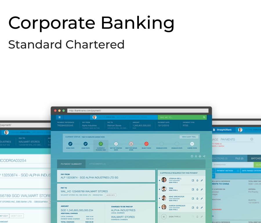
A global liquidity view for CFOs and treasurers, and batch creation and authorisation flows for operations teams.
- Global multi-currency liquidity dashboard
- Batch payment creation with inline validation
- Checker view with exceptions and audit history
06 · Impact
What changed, and how we know.
Every figure is labelled with what it measures. Reported figures are being matched to their original baselines and periods.
07 · Reflection
What I'd do differently at the next scale.
I would instrument the approval flow from day one, so the cycle-time improvement could be shown as a clean before/after comparison.
Bringing compliance into concept reviews worked; next time I would make it a formal stage of the design process.