Tata Pay UPI · Tata Digital · Tata Neu
Making UPI payments feel as trustworthy inside a super app as in a bank's own app.
I led the payment experience for Tata Pay inside Tata Neu: reorganising it around what people intend to do, keeping linked-bank status always visible, and treating failed payments as moments to reassure rather than dead ends.

Executive snapshot
- Product
- Tata Pay UPI within the Tata Neu super app
- My role
- Senior UX Designer and FinTech design lead
- Platforms
- iOS, Android, responsive web and SDK
- Payment rails
- NPCI UPI · multi-bank · P2P and P2M
- Partners
- Product, risk, payments engineering, brand teams
- Users
- Indian consumers across Tata Neu brands
01 · The stakes
Trust was the product.
Tata Pay runs on India's UPI rails, where people expect near-instant confirmation and bank-grade reassurance. Inside a multi-brand super app, any hesitation in the payment flow reduced checkout conversion across every brand.
The real problem was not adding UPI. It was making money movement feel transparent and consistent when people juggle several linked bank accounts, mandates and frequent bank-side downtime.


02 · My leadership contribution
Lead the payment experience end to end and create the patterns other Tata Neu teams would reuse for checkout.
- Team & collaboration model
- Design lead for the payments stream, partnering closely with product, risk and payments engineering.
- Key decision
- Model every transaction state with engineering and risk, then design explicit, honest messaging for each one.
- Stakeholder challenge
- Aligned brand teams who wanted their own checkout look with a shared, trusted payment layer.
- Operating rhythm
- Weekly reviews with risk and engineering on payment states; shared pattern library for downstream teams.
03 · Research & insight
What we learned before we designed.
Users compared us to their bank
Any visual hesitation or unfamiliar wording made people doubt the payment had worked.
Failures were misread as crashes
Bank downtime looked like an app error. People needed to know whether money had moved and what to do next.
Banking jargon slowed people down
People thought in terms of 'send', 'scan' and 'request', not account terminology.


04 · Decision stories
The calls that shaped the product.
Each decision follows the same path: signal, insight, options, decision, trade-off, outcome.
Decision 01
Intent-led hierarchy over banking jargon
- Signal
First-time users hesitated on the home surface.
- Insight
People arrive with one of four intentions.
- Options
Account-centric home; feature grid; or intent-first actions.
- Decision
Organise the main surface around Send, Scan & Pay, Request and Manage accounts.
- Trade-off
Less space for cross-sell placements on the main surface.
- Outcome
Around 40% fewer initial navigation steps (reported).
Decision 02
Failures as product moments
- Signal
Payment failures were read as generic app errors and drove duplicate attempts.
- Insight
The key question was always: did my money move?
- Options
Generic error with retry; or state-specific messaging with recovery actions.
- Decision
Model the transaction states with risk and engineering, then show funds status, timing and a safe next step for each one.
- Trade-off
Many more states to design and test than a single error screen.
- Outcome
Clearer understanding of failures and fewer duplicate payments (reported).
Decision 03
Always-visible multi-bank state
- Signal
People with several linked accounts paid from the wrong one.
- Insight
The active account had to be visible at the moment of payment.
- Options
Hide in settings; confirm on every payment; or a persistent account indicator with one-tap switch.
- Decision
Persistent active-account indicator with one-tap switching inside checkout.
- Trade-off
Extra visual weight on an already dense payment screen.
- Outcome
Higher reported confidence during repeat payments.

05 · System view
Payment tokens that scaled across the super app
Shared patterns let lending, gold, insurance and bill payments reuse the same trusted payment moments.
Biometric and PIN prompts
One consistent authentication pattern across every brand.
Bank badges and account chips
Recognisable bank identity at every step of a payment.
Numeric keypad
A shared, accessible keypad for amounts and UPI PIN.
Transaction states
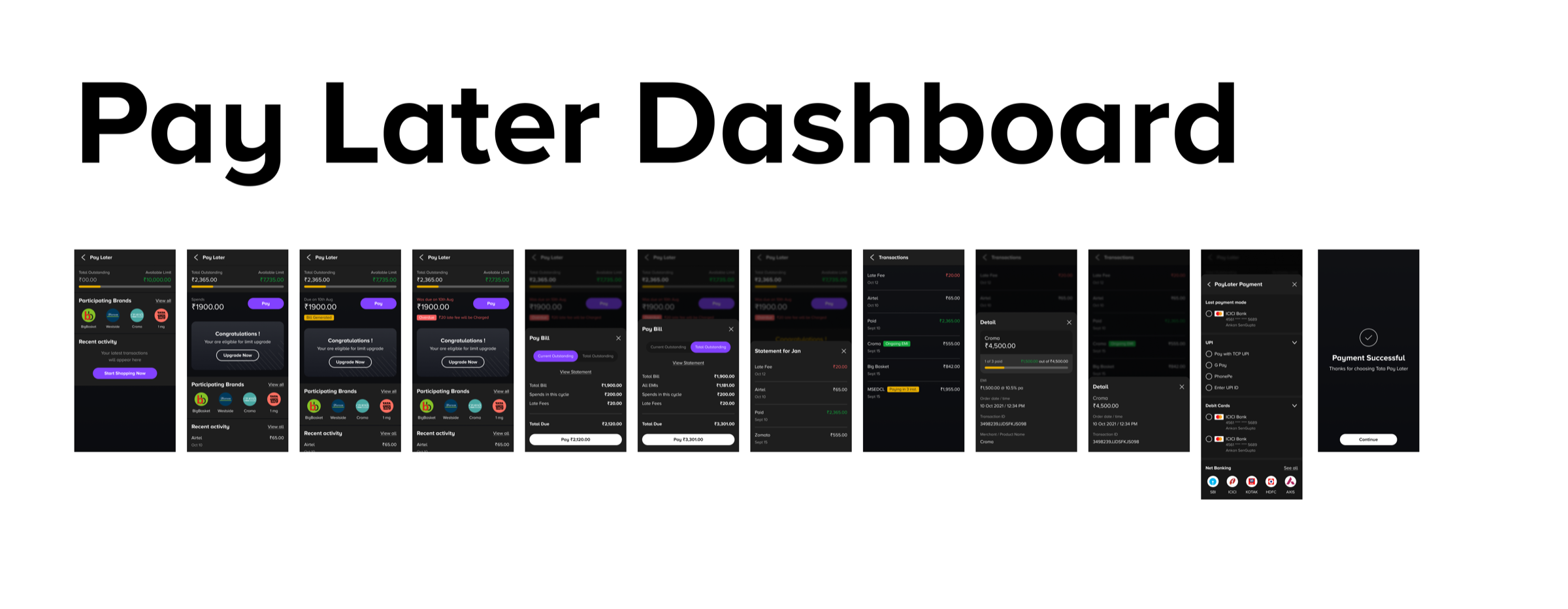
Success, pending, failed with funds deducted, failed without funds deducted, and reversed.
The shipped experience
Intent-first home, multi-bank management and clear payment status, on iOS, Android and web.
- Intent-first payment home
- Persistent bank account indicator
- Status screens that say whether money moved
06 · Impact
What changed, and how we know.
Every figure is labelled with what it measures. Reported figures are being matched to their original baselines and periods.
07 · Reflection
What I'd do differently at the next scale.
I would publish the transaction-state model as a shared artefact earlier; it became the most reused thing we made.
Next time I would pair every reported improvement with a controlled comparison, so the numbers are easier to defend.